
The More Open Avid Media Composer 6.0
Little Frog in High Def by Shane Ross
 I’m going to start out by saying that I was one of the beta testers of this version of Media Composer. One of a couple hundred actual end-users of the software. Editors from all walks of professional life who used the beta on some of our actual projects. Because it was a beta I only used it on non-time critical projects, but I did use it in real world application. Avid is showing a true commitment to professional editors by having the pros test every aspect of MC6 and provide feedback. Even on the UI. There were several instances when Avid conferenced-called us users and got our feedback on what we liked and didn’t like. What worked and didn’t work. And the feedback was almost instantaneous, as we’d have a new build to look at every week or two. They really listened to their base.
OK…that all said and done, let’s move onto the new features of Media Composer 6.0.
I will start first with what we all see when we first open up the application…the User Interface (UI). It has been updated from the old UI we have been using for a decade or two now, and it is pretty sleek. It is something we all got a taste of at the Avid Event in July (that I blogged about here), but at that time it wasn’t locked down. There were minor changes done since then…refinements to every part of the interface. Here, I’ll show you several pics, so you can see for yourself.
Here is a big picture of the grey interface.
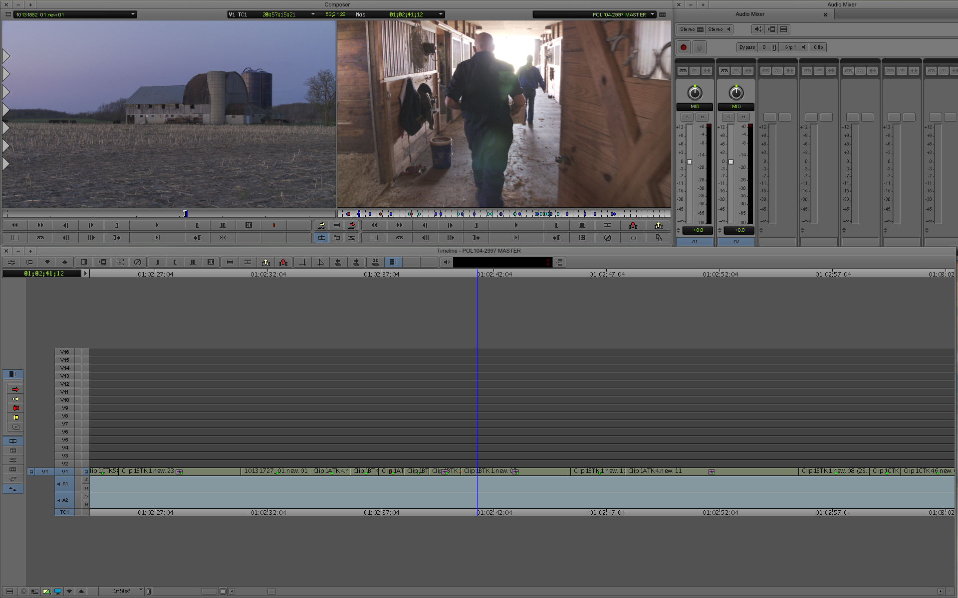
And here is a pic of the black interface (what I use)
You can have it look the normal flat grey…or you can go very dark grey.
You can choose one of 6 highlight colors (I like gold personally, and very dark). Missing are all the bin color options and various window color options, which I find refreshing. Mainly because I’d open up my in my assistant’s (or another editors) settings and be confronted with neon chaos. Avid is now keeping this simple. Some may like it, some may not. MC6_TimecodeReadout The timecode displays in the Composer window are green, like you’d see on a deck. This is not modifiable…which is fine by me (and the other editors on the beta). It is very readable, and stands out, without being obnoxious. read more...